
Yeppy Turning Payments into a Seamless SuperApp Experience
Yeppy Turning Payments into a Seamless SuperApp Experience
Company
Company
Yeppy, Kuwait
Yeppy, Kuwait
Research Methods
Research Methods
Product Research
UX Strategy
Interaction design
UX Design
Design System
Product Research
UX Strategy
Interaction design
UX Design
Design System
Project Overview
Project Overview
Project Overview
Yeppy is a Dubai-based super app designed to bring multiple everyday services into one place. In this case study we focused on the Finance module.
As a team of five designers, we worked closely together to make sure the experience fit well within Yeppy’s larger super-app ecosystem. Our goal was to keep it clear, secure, and easy for people from different backgrounds across the region to use.
Challenge
Challenge
Challenge
The main challenge was to design a finance module that could handle many features without feeling confusing or heavy.
The client wanted users to:
The main challenge was to design a finance module that could handle many features without feeling confusing or heavy.
The client wanted users to:
The main challenge was to design a finance module that could handle many features without feeling confusing or heavy.
The client wanted users to:
The main challenge was to design a finance module that could handle many features without feeling confusing or heavy.
The client wanted users to:
Manage payments, wallet balance, and transactions in one place.
Manage payments, wallet balance, and transactions in one place.
Manage payments, wallet balance, and transactions in one place.
Manage payments, wallet balance, and transactions in one place.
Feel confident and safe while using financial features.
Feel confident and safe while using financial features.
Feel confident and safe while using financial features.
Feel confident and safe while using financial features.
Understand their money without needing extra explanation.
Understand their money without needing extra explanation.
Understand their money without needing extra explanation.
Understand their money without needing extra explanation.
Avoid switching between multiple finance or banking apps.
Avoid switching between multiple finance or banking apps.
Avoid switching between multiple finance or banking apps.
Avoid switching between multiple finance or banking apps.
Because Yeppy is a super app, adding more features was easy but keeping the experience clear and simple was the real challenge.
Because Yeppy is a super app, adding more features was easy but keeping the experience clear and simple was the real challenge.
Because Yeppy is a super app, adding more features was easy but keeping the experience clear and simple was the real challenge.
Because Yeppy is a super app, adding more features was easy but keeping the experience clear and simple was the real challenge.
Research
Research
Research
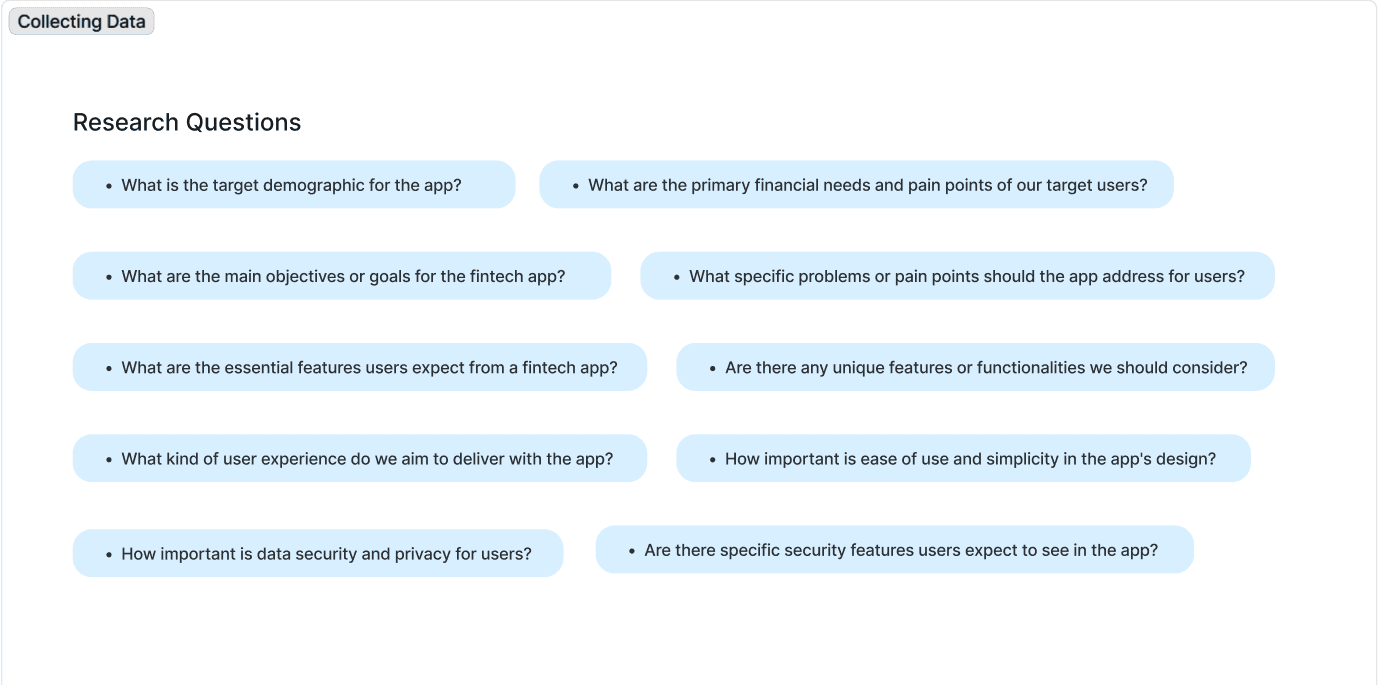
We conducted extensive research, gathering data from surveys, interviews, and market analysis to understand user needs, preferences, and pain points in existing fintech solutions.
We conducted extensive research, gathering data from surveys, interviews, and market analysis to understand user needs, preferences, and pain points in existing fintech solutions.
We conducted extensive research, gathering data from surveys, interviews, and market analysis to understand user needs, preferences, and pain points in existing fintech solutions.
We conducted extensive research, gathering data from surveys, interviews, and market analysis to understand user needs, preferences, and pain points in existing fintech solutions.
User Stories
User Stories
User Stories
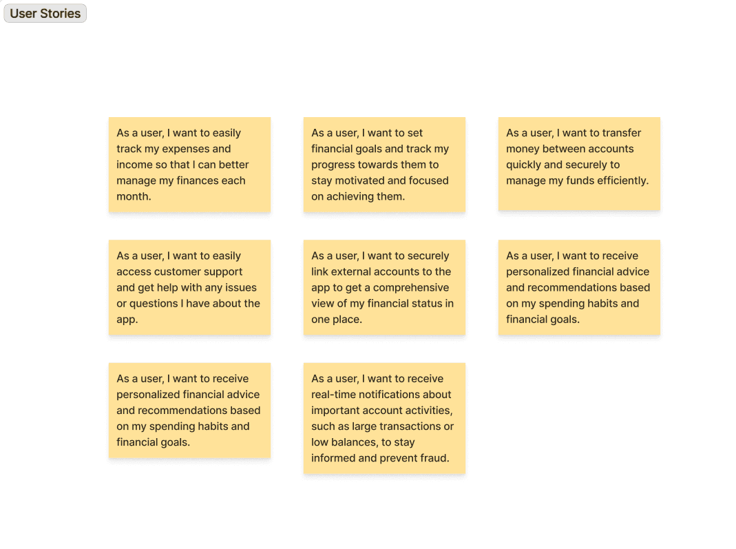
Based on research, we translated our findigns into user stories to keep the design focused on real needs:
Based on research, we translated our findigns into user stories to keep the design focused on real needs:
Based on research, we translated our findigns into user stories to keep the design focused on real needs:
Based on research, we translated our findigns into user stories to keep the design focused on real needs:
Mind Map
Mind Map
Mind Map
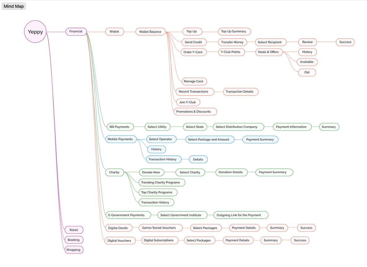
We created comprehensive mind map to visualize the relationship between various features and functionalities.
We created comprehensive mind map to visualize the relationship between various features and functionalities.
We created comprehensive mind map to visualize the relationship between various features and functionalities.
We created comprehensive mind map to visualize the relationship between various features and functionalities.
Design strategy
Design strategy
Design strategy
Our research showed that fixing individual screens would not be enough. Since Yeppy was being designed from the ground up, we needed a strong and consistent base for the entire finance experience.
To solve this, I proposed creating a design system to address core UI inconsistencies and to keep the product consistent as it grows. The goal was to make sure all screens follow the same rules for layout, spacing, colors, typography, and components.
With approval from our design lead, we built the design system as a team and used it across the platform.
Implementation
Implementation
Implementation
A key goal was to design the Home screen as a central place where users could access all important services.
We collaborated as a team to explore usability improvements and organized features like wallet balance, bill payments, mobile payments, charity donations, e-government payments, and digital goods in one view, helping users manage their financial activities more easily.


A key focus was improving how users track and understand their spending. We designed the expense view to present transactions in a clear, categorized list, allowing users to instantly see where their money is going.
The structure prioritizes readability and quick scanning, helping users review spending patterns without feeling overwhelmed. This shift turned expense tracking from a passive log into an active financial insight tool.

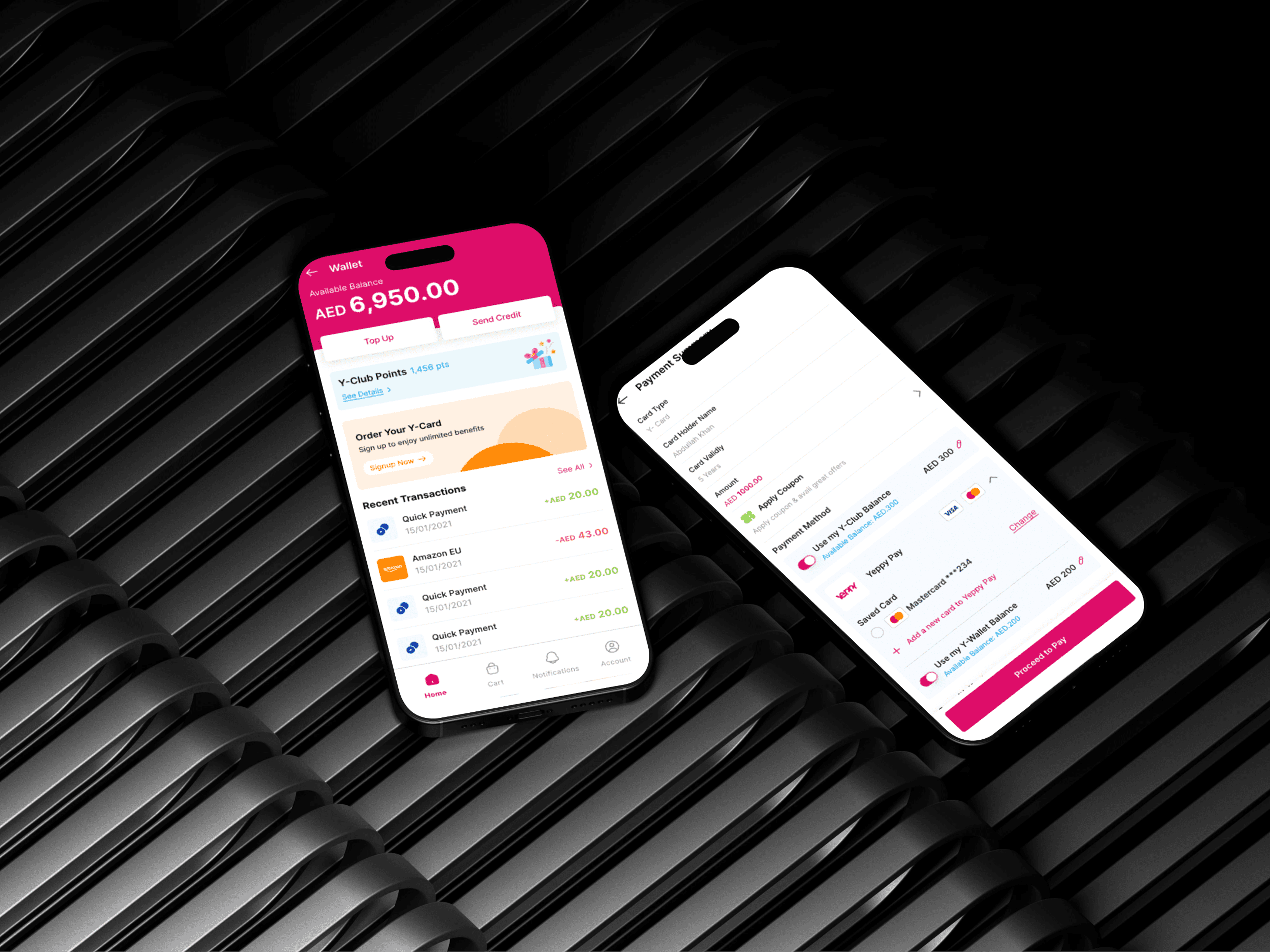
The goal was to make the wallet feel like a financial control center rather than just a balance screen. We structured the wallet to clearly surface available balance, Yeppy Club points, recent transactions, and active promotions in one cohesive layout.
To reduce friction in daily use, we introduced quick actions for topping up balance and sending credit. This minimized navigation steps and made everyday financial tasks faster and more intuitive.
We enabled mobile payments by allowing users to select their telecom operator and choose between prepaid, postpaid, or voucher options. Users can then select from available packages across providers, making mobile payments flexible and easy to manage.
We enabled mobile payments by allowing users to select their telecom operator and choose between prepaid, postpaid, or voucher options. Users can then select from available packages across providers, making mobile payments flexible and easy to manage.
We enabled mobile payments by allowing users to select their telecom operator and choose between prepaid, postpaid, or voucher options. Users can then select from available packages across providers, making mobile payments flexible and easy to manage.
We enabled mobile payments by allowing users to select their telecom operator and choose between prepaid, postpaid, or voucher options. Users can then select from available packages across providers, making mobile payments flexible and easy to manage.


The Fuel Card experience was designed to simplify fuel expense management. We structured the interface to clearly display card balance, transaction history, and usage details.
The goal was to provide transparency and quick access to key information, allowing users to monitor fuel spending efficiently and avoid unnecessary friction at the point of use.

Outcome
Outcome
Outcome
The final design delivered a polished and user-friendly finance module that aligned with Yeppy’s vision of an all-in-one super app.
The final design delivered a polished and user-friendly finance module that aligned with Yeppy’s vision of an all-in-one super app.
The final design delivered a polished and user-friendly finance module that aligned with Yeppy’s vision of an all-in-one super app.
The final design delivered a polished and user-friendly finance module that aligned with Yeppy’s vision of an all-in-one super app.
Key outcomes included:
Key outcomes included:
Key outcomes included:
Key outcomes included:
Clearer financial visibility through structured dashboards and transaction history
Clearer financial visibility through structured dashboards and transaction history
Clearer financial visibility through structured dashboards and transaction history
Clearer financial visibility through structured dashboards and transaction history
Simplified payment and wallet flows that reduced cognitive load
Simplified payment and wallet flows that reduced cognitive load
Simplified payment and wallet flows that reduced cognitive load
Simplified payment and wallet flows that reduced cognitive load
A consistent brand and UI system that strengthened trust and usability
A consistent brand and UI system that strengthened trust and usability
A consistent brand and UI system that strengthened trust and usability
A consistent brand and UI system that strengthened trust and usability
A scalable design foundation ready to support future features
A scalable design foundation ready to support future features
A scalable design foundation ready to support future features
A scalable design foundation ready to support future features
Key takeaways
Key takeaways
Key takeaways
Finance products need clarity more than complexity
Finance products need clarity more than complexity
Finance products need clarity more than complexity
Finance products need clarity more than complexity
Research helps avoid designing based on assumptions
Research helps avoid designing based on assumptions
Research helps avoid designing based on assumptions
Research helps avoid designing based on assumptions
Clear structure is more important than visual decoration
Clear structure is more important than visual decoration
Clear structure is more important than visual decoration
Clear structure is more important than visual decoration
Team collaboration improves consistency and quality
Team collaboration improves consistency and quality
Team collaboration improves consistency and quality
Team collaboration improves consistency and quality

Have an idea?
Let's work together
Let’s turn your vision into a seamless and standout experience
Copyright © 2026 Muntaha. All rights reserved.
Have an idea?
Let's work together
Let’s turn your vision into a seamless and standout experience
Copyright © 2026 Muntaha. All rights reserved.
Have an idea?
Let's work together
Let’s turn your vision into a seamless and standout experience
Copyright © 2026 Muntaha. All rights reserved.
Have an idea?
Let's work together
Let’s turn your vision into a seamless and standout experience
Copyright © 2026 Muntaha. All rights reserved.
Have an idea?
Let's work together
Let’s turn your vision into a seamless and standout experience
Copyright © 2026 Muntaha. All rights reserved.