
Transforming a complex clinical workflow into intuitive system
Transforming a complex clinical workflow into intuitive system
Company
Company
Octdaily
Octdaily
Research Methods
Research Methods
UX Design
Stakeholder Interviews
Heuristic Evaluation
Flow Redesign
Design System
UX Design
Stakeholder Interviews
Heuristic Evaluation
Flow Redesign
Design System

Project Overview
Project Overview
Project Overview
Project Overview
Veritas, a genomic testing platform used by specialist physicians and care teams, had accumulated UX debt that was causing real clinical drop-off.
Veritas, a genomic testing platform used by specialist physicians and care teams, had accumulated UX debt that was causing real clinical drop-off.
Veritas, a genomic testing platform used by specialist physicians and care teams, had accumulated UX debt that was causing real clinical drop-off.
Problem & Challenge
Problem & Challenge
Problem & Challenge
Problem & Challenge
Veritas is a clinical decision support platform that helps specialists, PCPs, geneticists, and care coordinators manage genomic test recommendations, consent forms, lab results, and patient appointments in one place.
The original interface was built quickly to get the product into the hands of early customers. It worked. But as the user base grew and workflows became more complex, cracks appeared. Care providers were dropping off mid-task. Stakeholders were frustrated. The system didn't reflect how clinicians actually think or work.
We spoke directly with care providers and internal stakeholders to understand the friction points. The problems weren't cosmetic, they were structural.
Veritas is a clinical decision support platform that helps specialists, PCPs, geneticists, and care coordinators manage genomic test recommendations, consent forms, lab results, and patient appointments in one place.
The original interface was built quickly to get the product into the hands of early customers. It worked. But as the user base grew and workflows became more complex, cracks appeared. Care providers were dropping off mid-task. Stakeholders were frustrated. The system didn't reflect how clinicians actually think or work.
We spoke directly with care providers and internal stakeholders to understand the friction points. The problems weren't cosmetic, they were structural.
Veritas is a clinical decision support platform that helps specialists, PCPs, geneticists, and care coordinators manage genomic test recommendations, consent forms, lab results, and patient appointments in one place.
The original interface was built quickly to get the product into the hands of early customers. It worked. But as the user base grew and workflows became more complex, cracks appeared. Care providers were dropping off mid-task. Stakeholders were frustrated. The system didn't reflect how clinicians actually think or work.
We spoke directly with care providers and internal stakeholders to understand the friction points. The problems weren't cosmetic, they were structural.
01
No clear information hierarchy
Patient details, lab results, test recommendations, and appointments were scattered across tabs with no logical priority. Providers had to remember where things lived.
No clear information hierarchy
Patient details, lab results, test recommendations, and appointments were scattered across tabs with no logical priority. Providers had to remember where things lived.
No clear information hierarchy
Patient details, lab results, test recommendations, and appointments were scattered across tabs with no logical priority. Providers had to remember where things lived.
02
Fragmented test recommendation flow
Adding a genomic test required navigating a dense modal with no clear step-by-step guidance. ICD codes, test panels, and recommendations were all in one unstructured form.
Fragmented test recommendation flow
Adding a genomic test required navigating a dense modal with no clear step-by-step guidance. ICD codes, test panels, and recommendations were all in one unstructured form.
Fragmented test recommendation flow
Adding a genomic test required navigating a dense modal with no clear step-by-step guidance. ICD codes, test panels, and recommendations were all in one unstructured form.
03
Navigation that worked against clinical context
The sidebar navigation didn't reflect the clinical workflow. Providers jumping between patients lost their context and had to re-establish orientation on every screen change.
Navigation that worked against clinical context
The sidebar navigation didn't reflect the clinical workflow. Providers jumping between patients lost their context and had to re-establish orientation on every screen change.
Navigation that worked against clinical context
The sidebar navigation didn't reflect the clinical workflow. Providers jumping between patients lost their context and had to re-establish orientation on every screen change.
04
Unstructured AI output with no visual separation
The AI-generated Veritas Recommendation Summary was rendered as a raw block of template variables and text, clinically important content that looked like debugging output.
Unstructured AI output with no visual separation
The AI-generated Veritas Recommendation Summary was rendered as a raw block of template variables and text, clinically important content that looked like debugging output.
Unstructured AI output with no visual separation
The AI-generated Veritas Recommendation Summary was rendered as a raw block of template variables and text, clinically important content that looked like debugging output.

Understanding the System
Understanding the System
Understanding the System
Understanding the System
I started with a structured audit of the existing Patients experience rather than jumping directly into visual redesign.
I reviewed the existing navigation, patient queue, recommendation workflow and appointment experience screen by screen, mapping where information was duplicated, where hierarchy was unclear and where important actions were hidden behind additional navigation.
I then mapped the underlying workflow against the interface structure. This highlighted a mismatch between how the product was organized and how the clinical workflow needed to be understood: patient → order → recommendation/results → follow-up actions.
From there, I used the findings to define a set of design hypotheses and tested those hypotheses through successive design iterations.
I started with a structured audit of the existing Patients experience rather than jumping directly into visual redesign.
I reviewed the existing navigation, patient queue, recommendation workflow and appointment experience screen by screen, mapping where information was duplicated, where hierarchy was unclear and where important actions were hidden behind additional navigation.
I then mapped the underlying workflow against the interface structure. This highlighted a mismatch between how the product was organized and how the clinical workflow needed to be understood: patient → order → recommendation/results → follow-up actions.
From there, I used the findings to define a set of design hypotheses and tested those hypotheses through successive design iterations.
I started with a structured audit of the existing Patients experience rather than jumping directly into visual redesign.
I reviewed the existing navigation, patient queue, recommendation workflow and appointment experience screen by screen, mapping where information was duplicated, where hierarchy was unclear and where important actions were hidden behind additional navigation.
I then mapped the underlying workflow against the interface structure. This highlighted a mismatch between how the product was organized and how the clinical workflow needed to be understood: patient → order → recommendation/results → follow-up actions.
From there, I used the findings to define a set of design hypotheses and tested those hypotheses through successive design iterations.

Approach
Approach
Approach
We didn't redesign for aesthetics. Every decision was traced back to a real user need surfaced in research. These four principles became our north star throughout the process.
We didn't redesign for aesthetics. Every decision was traced back to a real user need surfaced in research. These four principles became our north star throughout the process.
We didn't redesign for aesthetics. Every decision was traced back to a real user need surfaced in research. These four principles became our north star throughout the process.

Revised User Flow
Revised User Flow
Revised User Flow
The original flow had too many conditional branches happening inside a single screen. We restructured it so each decision point is its own step; clear, predictable, and recoverable.
The original flow had too many conditional branches happening inside a single screen. We restructured it so each decision point is its own step; clear, predictable, and recoverable.
The original flow had too many conditional branches happening inside a single screen. We restructured it so each decision point is its own step; clear, predictable, and recoverable.

Design System
Design System
Design System
Once the information architecture was established, I made sure the redesigned screens didn't become six individually designed pages.
This mattered because the product wasn't just getting a visual refresh.
It needed a structure that could continue growing without creating another collection of one-off screens.
Once the information architecture was established, I made sure the redesigned screens didn't become six individually designed pages.
This mattered because the product wasn't just getting a visual refresh.
It needed a structure that could continue growing without creating another collection of one-off screens.
Once the information architecture was established, I made sure the redesigned screens didn't become six individually designed pages.
This mattered because the product wasn't just getting a visual refresh.
It needed a structure that could continue growing without creating another collection of one-off screens.
Design solution
Design solution
Design solution
Each decision below addresses a specific failure in the original interface, mapped directly to a user pain point, a business need, and a measurable improvement in workflow clarity.
Each decision below addresses a specific failure in the original interface, mapped directly to a user pain point, a business need, and a measurable improvement in workflow clarity.
Each decision below addresses a specific failure in the original interface, mapped directly to a user pain point, a business need, and a measurable improvement in workflow clarity.
Rebuilding Navigation And Patients Architecture
From three competing layers to one contextual hierarchy. The Patients module was one of the biggest areas of the redesign. It showed useful information, but the layout made it difficult to scan and compare records at scale.
I redesigned it as a full-width table with the information clinical staff actually need when working through a queue:
Rebuilding Navigation And Patients Architecture
From three competing layers to one contextual hierarchy. The Patients module was one of the biggest areas of the redesign. It showed useful information, but the layout made it difficult to scan and compare records at scale.
I redesigned it as a full-width table with the information clinical staff actually need when working through a queue:
Rebuilding Navigation And Patients Architecture
From three competing layers to one contextual hierarchy. The Patients module was one of the biggest areas of the redesign. It showed useful information, but the layout made it difficult to scan and compare records at scale.
I redesigned it as a full-width table with the information clinical staff actually need when working through a queue:


Why This Decision
Why This Decision
Why This Decision
The old tab-based model treated every section of a patient record as equally important and equally accessible. In reality, clinical work follows a hierarchy: you start with patient information, move to lab results, then to recommendations, then to publishing.
The redesigned sidebar exposes this natural flow explicitly. Collapsible Orders also solve a real multi-order problem patients often have 3–4 concurrent orders, each needing their own recommendation and appointment cycles. Flat tabs couldn't accommodate this without adding even more tabs.
The old tab-based model treated every section of a patient record as equally important and equally accessible. In reality, clinical work follows a hierarchy: you start with patient information, move to lab results, then to recommendations, then to publishing.
The redesigned sidebar exposes this natural flow explicitly. Collapsible Orders also solve a real multi-order problem patients often have 3–4 concurrent orders, each needing their own recommendation and appointment cycles. Flat tabs couldn't accommodate this without adding even more tabs.
The old tab-based model treated every section of a patient record as equally important and equally accessible. In reality, clinical work follows a hierarchy: you start with patient information, move to lab results, then to recommendations, then to publishing.
The redesigned sidebar exposes this natural flow explicitly. Collapsible Orders also solve a real multi-order problem patients often have 3–4 concurrent orders, each needing their own recommendation and appointment cycles. Flat tabs couldn't accommodate this without adding even more tabs.
Turning an overloaded Test Recommendation form
The Test Recommendation experience was another major part of the redesign.
The previous version tried to do too much in one place.
Test types, ICD codes, recommendations and other information were presented together, making the screen feel more like a large form than a review workflow.
I changed the structure into two levels.
First: portfolio view
A table gives users an overview of recommendations before they open one.
Second: focused review
Selecting a recommendation opens the detailed review experience.
Turning an overloaded Test Recommendation form
The Test Recommendation experience was another major part of the redesign.
The previous version tried to do too much in one place.
Test types, ICD codes, recommendations and other information were presented together, making the screen feel more like a large form than a review workflow.
I changed the structure into two levels.
First: portfolio view
A table gives users an overview of recommendations before they open one.
Second: focused review
Selecting a recommendation opens the detailed review experience.
Turning an overloaded Test Recommendation form
The Test Recommendation experience was another major part of the redesign.
The previous version tried to do too much in one place.
Test types, ICD codes, recommendations and other information were presented together, making the screen feel more like a large form than a review workflow.
I changed the structure into two levels.
First: portfolio view
A table gives users an overview of recommendations before they open one.
Second: focused review
Selecting a recommendation opens the detailed review experience.


Why This Decision
Why This Decision
Why This Decision
The old test recommendation screen was a single-step form that mixed data entry with AI output in one undifferentiated panel. There was no way to track which tests had been reviewed, which were approved, or which needed clinical follow-up. The redesign introduces a two-stage workflow: first, a structured table gives a portfolio view of all recommendations with explicit status badges (Under Review, Approved, Not Qualified, Rework Needed). Then, the dual-pane review interface creates a clear human AI boundary, the editable summary on the left is always the clinician's work; the Veritas AI output on the right is always read-only reference. A "Copy Veritas Response" button bridges the two when needed.
The old test recommendation screen was a single-step form that mixed data entry with AI output in one undifferentiated panel. There was no way to track which tests had been reviewed, which were approved, or which needed clinical follow-up. The redesign introduces a two-stage workflow: first, a structured table gives a portfolio view of all recommendations with explicit status badges (Under Review, Approved, Not Qualified, Rework Needed). Then, the dual-pane review interface creates a clear human AI boundary, the editable summary on the left is always the clinician's work; the Veritas AI output on the right is always read-only reference. A "Copy Veritas Response" button bridges the two when needed.
The old test recommendation screen was a single-step form that mixed data entry with AI output in one undifferentiated panel. There was no way to track which tests had been reviewed, which were approved, or which needed clinical follow-up. The redesign introduces a two-stage workflow: first, a structured table gives a portfolio view of all recommendations with explicit status badges (Under Review, Approved, Not Qualified, Rework Needed). Then, the dual-pane review interface creates a clear human AI boundary, the editable summary on the left is always the clinician's work; the Veritas AI output on the right is always read-only reference. A "Copy Veritas Response" button bridges the two when needed.
Operational Workday Flow
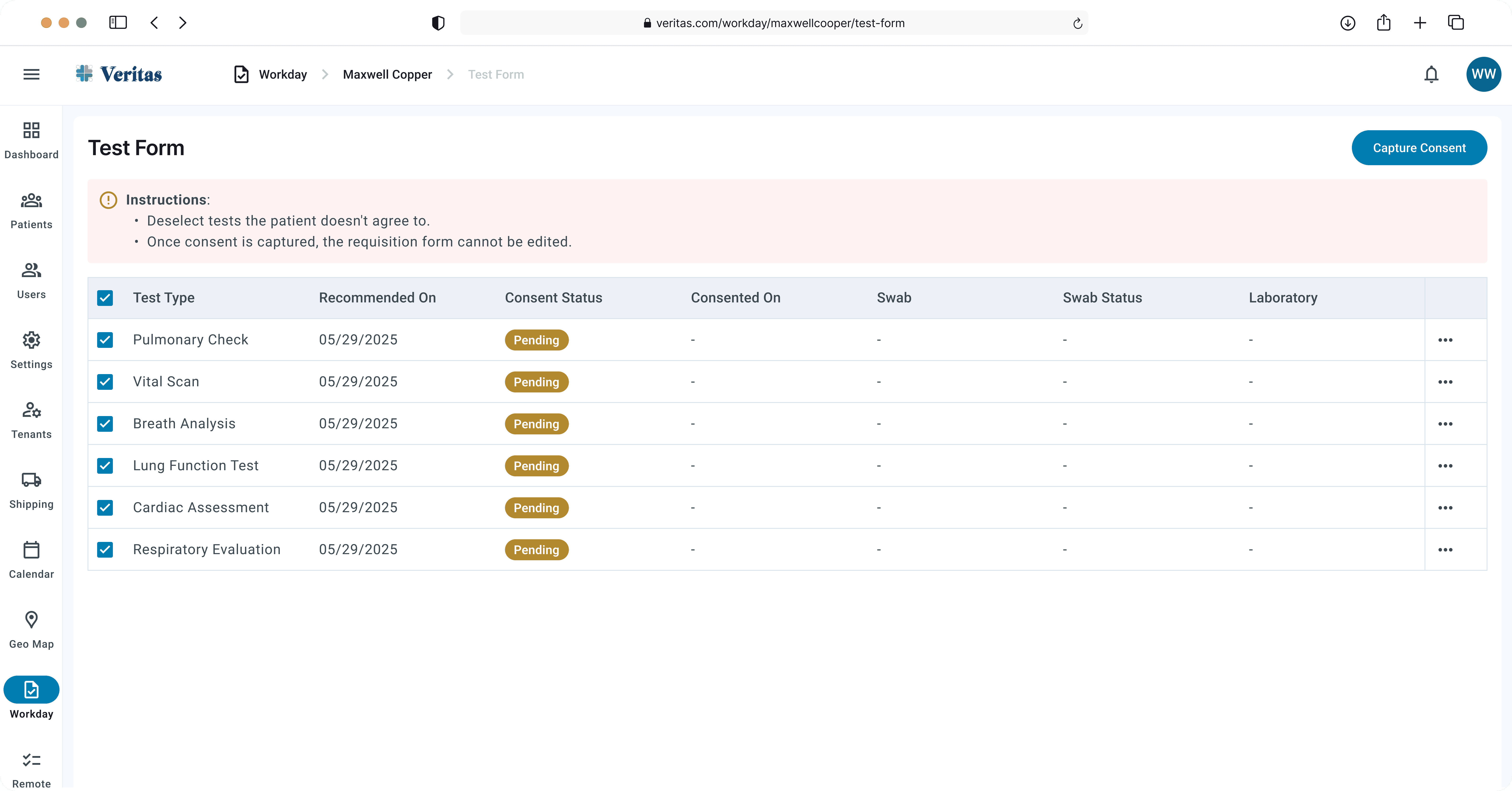
The Workday experience is less about one individual patient and more about the day-to-day operational work around patients and appointments.
The design work here focused on making the working state easier to scan and act on.
Operational Workday Flow
The Workday experience is less about one individual patient and more about the day-to-day operational work around patients and appointments.
The design work here focused on making the working state easier to scan and act on.
Operational Workday Flow
The Workday experience is less about one individual patient and more about the day-to-day operational work around patients and appointments.
The design work here focused on making the working state easier to scan and act on.

Why This Decision
Why This Decision
Why This Decision
Workday extends Veritas beyond the individual patient record into the broader operational workflow. Rather than designing it as a standalone experience, I carried the same navigation, component and interaction language into the module so it feels like a natural part of the wider product rather than another tool users have to learn.
Workday extends Veritas beyond the individual patient record into the broader operational workflow. Rather than designing it as a standalone experience, I carried the same navigation, component and interaction language into the module so it feels like a natural part of the wider product rather than another tool users have to learn.
Workday extends Veritas beyond the individual patient record into the broader operational workflow. Rather than designing it as a standalone experience, I carried the same navigation, component and interaction language into the module so it feels like a natural part of the wider product rather than another tool users have to learn.
Data Import Feel Controlled
Data import is another place where clarity matters more than decoration.
Importing data isn't just about uploading a file.
The design approach
Select / Import → Review → Validate → Confirm → Status
The important part is giving users visibility into the state of the process.
Instead of making the system feel like a black box, the UI provides clear feedback around the import and its progress.
Data Import Feel Controlled
Data import is another place where clarity matters more than decoration.
Importing data isn't just about uploading a file.
The design approach
Select / Import → Review → Validate → Confirm → Status
The important part is giving users visibility into the state of the process.
Instead of making the system feel like a black box, the UI provides clear feedback around the import and its progress.
Data Import Feel Controlled
Data import is another place where clarity matters more than decoration.
Importing data isn't just about uploading a file.
The design approach
Select / Import → Review → Validate → Confirm → Status
The important part is giving users visibility into the state of the process.
Instead of making the system feel like a black box, the UI provides clear feedback around the import and its progress.


Why This Decision
Why This Decision
Why This Decision
Data Import isn't just about getting a file into the system, the uploaded information needs to be interpreted and reviewed before it becomes part of the workflow. I designed the import experience around that transition, using AI to process the uploaded data and surface the relevant information for review, while keeping the user in control of what gets accepted into the system.
Data Import isn't just about getting a file into the system, the uploaded information needs to be interpreted and reviewed before it becomes part of the workflow. I designed the import experience around that transition, using AI to process the uploaded data and surface the relevant information for review, while keeping the user in control of what gets accepted into the system.
Data Import isn't just about getting a file into the system, the uploaded information needs to be interpreted and reviewed before it becomes part of the workflow. I designed the import experience around that transition, using AI to process the uploaded data and surface the relevant information for review, while keeping the user in control of what gets accepted into the system.
Appointments — Upcoming vs. Past
Appointments were previously treated as one more tab inside the patient record.
That made upcoming and historical appointments compete for the same space.
Appointments — Upcoming vs. Past
Appointments were previously treated as one more tab inside the patient record.
That made upcoming and historical appointments compete for the same space.
Appointments — Upcoming vs. Past
Appointments were previously treated as one more tab inside the patient record.
That made upcoming and historical appointments compete for the same space.


Why This Decision
Why This Decision
Why This Decision
Appointments were previously accessible only as one of six equal tabs, they had no visual hierarchy and no action-forward design. The redesign elevates appointments to a full dedicated page with two clearly labeled sections: Upcoming (actionable edit or cancel) and Past (read-only reference). The "Schedule Appointment" button is always visible in the top-right corner, not buried behind multiple clicks. Status badges (Scheduled, Cancelled) give an immediate visual scan of the appointment calendar's health, and a date-picker modal was designed for intuitive time slot selection without leaving the page context.
Appointments were previously accessible only as one of six equal tabs, they had no visual hierarchy and no action-forward design. The redesign elevates appointments to a full dedicated page with two clearly labeled sections: Upcoming (actionable edit or cancel) and Past (read-only reference). The "Schedule Appointment" button is always visible in the top-right corner, not buried behind multiple clicks. Status badges (Scheduled, Cancelled) give an immediate visual scan of the appointment calendar's health, and a date-picker modal was designed for intuitive time slot selection without leaving the page context.
Appointments were previously accessible only as one of six equal tabs, they had no visual hierarchy and no action-forward design. The redesign elevates appointments to a full dedicated page with two clearly labeled sections: Upcoming (actionable edit or cancel) and Past (read-only reference). The "Schedule Appointment" button is always visible in the top-right corner, not buried behind multiple clicks. Status badges (Scheduled, Cancelled) give an immediate visual scan of the appointment calendar's health, and a date-picker modal was designed for intuitive time slot selection without leaving the page context.
What changed
What changed
What changed
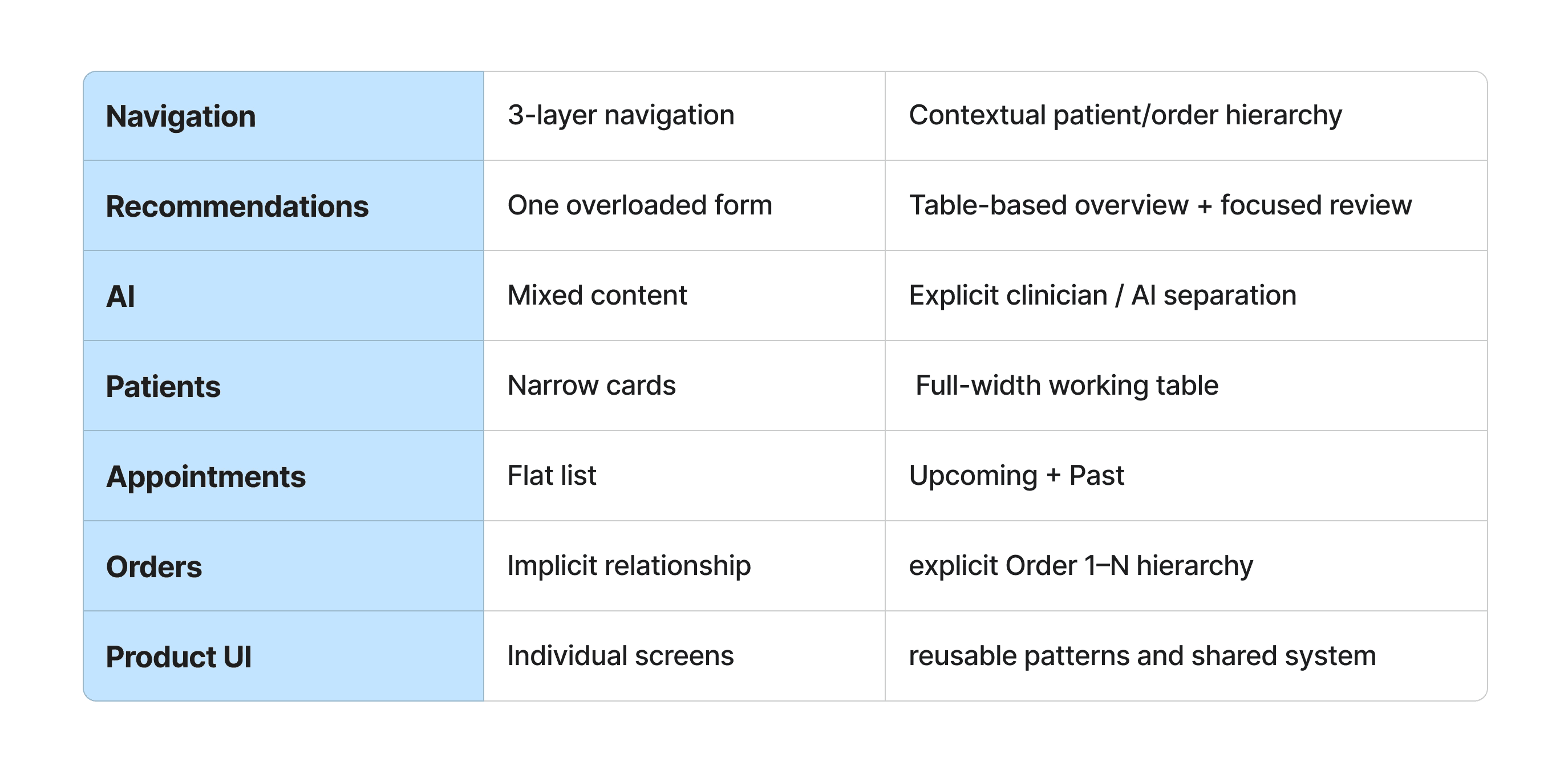
The redesign introduced a clearer structure across the Patients experience and its connected workflows.
The redesign introduced a clearer structure across the Patients experience and its connected workflows.
The redesign introduced a clearer structure across the Patients experience and its connected workflows.
The redesign introduced a clearer structure across the Patients experience and its connected workflows.
What I learned
What I learned
What I learned
The biggest lesson from Veritas was that complex products don't necessarily need less information, they need better relationships between information.
It's about understanding how information is connected to the work people need to do.
The patient record, orders, recommendations, results and appointments aren't separate features. They're parts of the same workflow.
So my focus throughout the redesign was to make those relationships visible while giving each module enough structure to work on its own.
The result was a more structured foundation for a complex healthcare product: clearer navigation, more scannable data, explicit workflow states, and a more deliberate boundary between clinician work and AI assistance.
The biggest lesson from Veritas was that complex products don't necessarily need less information, they need better relationships between information.
It's about understanding how information is connected to the work people need to do.
The patient record, orders, recommendations, results and appointments aren't separate features. They're parts of the same workflow.
So my focus throughout the redesign was to make those relationships visible while giving each module enough structure to work on its own.
The result was a more structured foundation for a complex healthcare product: clearer navigation, more scannable data, explicit workflow states, and a more deliberate boundary between clinician work and AI assistance.
The biggest lesson from Veritas was that complex products don't necessarily need less information, they need better relationships between information.
It's about understanding how information is connected to the work people need to do.
The patient record, orders, recommendations, results and appointments aren't separate features. They're parts of the same workflow.
So my focus throughout the redesign was to make those relationships visible while giving each module enough structure to work on its own.
The result was a more structured foundation for a complex healthcare product: clearer navigation, more scannable data, explicit workflow states, and a more deliberate boundary between clinician work and AI assistance.

Have an idea?
Let's work together
Let’s turn your vision into a seamless and standout experience
Copyright © 2026 Muntaha. All rights reserved.
Have an idea?
Let's work together
Let’s turn your vision into a seamless and standout experience
Copyright © 2026 Muntaha. All rights reserved.
Have an idea?
Let's work together
Let’s turn your vision into a seamless and standout experience
Copyright © 2026 Muntaha. All rights reserved.
Have an idea?
Let's work together
Let’s turn your vision into a seamless and standout experience
Copyright © 2026 Muntaha. All rights reserved.